%20-%20Silver.png)
Timeframe
31 Days
Project Type
Website Redesign, Food & Drink, Improving a small business
Role
Sole Designer, Research, UI/UX Design, Prototyping, Testing
My Relationship with Donkey Coffee
Context
Donkey Coffee has always been more than just a coffee shop to me—it was my favorite spot in college to study, feel inspired, and hang out with friends. It has this cozy, creative vibe that makes you want to stay awhile. But when I visited their website, it just didn’t match the energy of the actual place. It felt outdated, cluttered, and kind of missed the heart that makes Donkey so special. That’s what made me want to take on this redesign.
The Problem
How might I preserve the personality of Donkey Coffee while improving the site’s usability and making essential information easier to find—especially for busy students accessing it on the go?
The original Donkey Coffee website had character, but its cluttered layout and inconsistent design made key information—like the menu, location, and hours—hard to find, especially on mobile. Navigation felt unintuitive, and visual inconsistencies in buttons and typography hindered user engagement. For a café that thrives on community and connection, particularly with university students, the digital experience wasn’t living up to the brand.
Solution
My redesign sought to preserve Donkey Coffee’s charm while making the site more functional and user-centered. I began with user interviews and competitive analysis to understand expectations for a local coffee shop website. From there, I simplified the layout, prioritized essential content like the menu, and introduced consistent UI patterns for a smoother experience. The site was optimized for all devices, with visuals and tone that reflect Donkey’s creative, community-focused vibe.
Heauristic Evaluation
Reviewing the Current Site
Critical Issues with the Site
Matching between the system & real world
Homepage is unorganized and does not seem like sections are at a place where users would look for it - absence of address
My Recommendation
Move awards CTA on a separate tab that isn't the homepage, replace with “Order Online” or “See Menu.” Rename CTAs to provide more clarification to the user.


Consistency & standards
Buttons on the right side of the platform on certain pages display as different colors, even though the actions seem similar. This could cause confusion on what is an actionable button or not. There is also inconsistent font sizes and locations on the home page.
My Recommendation
Ensure consistent design, CTAs, and font styles, sizes and alignment.

The colors and UI design could be used in a more consistent way. Website is too cluttered as well and outdated.
My Recommendation
Modernize the website to make it cleaner and use the colors to make it look more visually appealing.

Aesthetic & minimalist design
User Interviews
What do User's Look for in a Cafe Site?
Number of Participants
5 interviewees
Methodology
1:1 interviews conducted on Microsoft Teams
Demographics
College students
Goal
Explore user behaviors, preferences, and expectations when visiting coffee shops or restaurant websites.
Key Data & Findings
100%
of the interviewees stressed that finding the menu was very important if not the most essential.
All participants explained that finding the menu is the most critical when visiting a coffee shop or restaurant website.
100%
expect contact details and address of the coffee shop easy to find.
The participants preferred the coffee shop address to either be on the bottom of the website or under the shop name.
60%
Never look for merchandise on a coffee shop site.
I asked this question because the website today displays a dedicated section for their merchandise and I wanted to know if users valued this.
Key Pain Points & Challenges
80%
of users felt the site was missing key information or had poor navigation.
User's commented that the website had clunky structure and it was hard to navigate.
60%
of users had no interest in the 'Social justice and Events' section.
Not too many interviewees expressed interest in this section of the website.
60%
of users didn’t engage with the mobile version positively.
Users also reported clunky navigation, lack of mobile usability, and missing link on the mobile site.
Competitive Analysis
Reviewing other Coffee Shops' Sites
.png)


For the competitive analysis, I reviewed two other local coffee shops in the area (Court Street Coffee and Brenen's Cafe) as well as a national brand (Starbucks) to see how their websites look and what they brought to the table. This helped me keep things in mind and help me identify different opportunities for my redesign.
Court Street Coffee - The website lacks clear calls-to-action (CTAs) and relies heavily on brand loyalty within the local college and Athens community. Their menu redirects users to a third-party online ordering platform, which may disrupt the user flow.
Starbucks - The site immediately directs visitors to their menu, streamlining the online ordering process. As a well-known brand, Starbucks leans on national recognition and loyalty, allowing for a more minimal homepage experience.
Brenen's Cafe - Brenen’s uniquely promotes their college meal plans prominently on the homepage, catering directly to students. However, their menu is only accessible as a downloadable PDF, and they do not currently offer online ordering functionality.

Affinity Map
Organizing my Findings
88%
Expected the menu to be accessible within one click of the homepage.
88%
said they visit coffee shop websites to review the menu or overall vibe before visiting.
88%
of participants expected to see pictures of the food or establishment on the homepage.
75%
were frustrated when the menu was not located where they expected it (home page, top nav, or labeled clearly).
81%
of participants expected to find the address at the bottom of the homepage or within a clearly labeled “Visit Us” or “Contact” tab.
63%
of participants felt the current site conveyed a good vibe of the coffee shop but had clunky or confusing layouts.
User Persona
A Hardworking College Student
Based on my research, I developed a user persona that reflects common expectations when visiting a coffee shop website. This persona is a hardworking college student who visits these sites to get a feel for the café’s vibe, easily view the menu, and decide whether it’s a good spot to study.

Feature Set
What is Most Important to Include?
Based on my research, it became clear that most users expect the menu and address to be easily accessible on the website. This insight guided my decision to prioritize those elements in the layout, alongside visual cues that highlight the restaurant’s unique style and atmosphere. I chose to retain the Events and Shop sections to promote Donkey Coffee’s merchandise and reflect its strong musical roots. Additionally, Donkey’s rewards program presents an opportunity to be featured in a future iteration of the design.
Must Haves
Built-in online ordering
Address details
'Our Story' tab
'Contact Us' tab
Restaurant visuals
Location & hours display
Nice to Haves
Events tab
Shopping tab
Daily specials section
Awards & achievements showcase
Can Come Later
Rewards program section
User Flows
Mapping the Experience
Viewing Menu and Ordering Online
The research clearly showed that viewing the menu and ordering online are essential parts of a coffee shop website experience. With this in mind, I mapped out the key screens and actions a user would navigate to complete this process smoothly.

Low-Fidelity Wireframes
Early Mockups of my Design

Touchpoints
Desktop

My initial homepage went straight to the menu for online ordering, based on the importance of the menu to users, address at the bottom.

After selecting the coffee, the user is taken to many customizable options.

User can review their order and submit.

Order is confirmed and address is displayed; options to shop for merch and coffee beans.
Mobile

When doing mobile design, I had the idea to do a homepage that displays featured menu items to showcase the vibe as well as the menu.

Mobile version of the menu, similar to desktop.

Drink selection; similar to desktop.

Easy method to edit and remove order, and confirm.

Confirmation page; similar to desktop.
High-Fidelity Prototype
Adding Personality
Touchpoints
I added personality to the redesign by incorporating the shop’s signature colors and showcasing real photos of the coffee shop, highlighting its warm, inviting atmosphere as an ideal place to relax or study.
Desktop
Mobile

Homepage

Menu

Drink Selection

Checkout

Confirmation
Mobile

Homepage

Menu

Drink Selection

Checkout

Confirmation
User Testing
Brewing a Better User Journey
Now it’s time to test! I conducted usability testing on the high-fidelity design to evaluate how well the flow worked (ordering a latte) and to gather insights on how users interacted with it and what feedback they shared.
Number of Participants
5 participants
Methodology
Remote test on Maze.
Success Rate
Demographics
College students
Goal
-
Measure the success of the 'ordering a coffee' flow and other insight.
100%
Iterations
Feedback Driven Changes
Reducing Size & Text of Homepage
I received feedback that the mobile homepage involved too much scrolling and text. To improve the experience, I introduced a slider to make the content more digestible and reduce cognitive load, allowing users to browse more efficiently.

Before

After
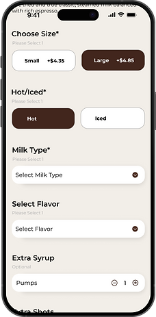
Avoiding Clutter
I also received feedback to simplify required field indicators—replacing phrases like ‘Required’ and ‘Please select 1’ with just an asterisk (*) to make the form cleaner and easier to scan.

Before
After
Dropdowns
I adjusted the dropdown menus to open downward instead of upward, based on tester feedback. This change aligned better with the natural downward scrolling flow of the screen and improved overall usability.

Before

After
Conclusion
Closing Reflections
This project was more than just a redesign—it was a way for me to give back to a place that’s meant so much to me. Donkey Coffee has always been about comfort, community, and creativity, and I wanted the website to reflect that same energy. By grounding every decision in research, usability principles, and the real behaviors of college students, I was able to transform an outdated site into something that feels both welcoming and functional—just like the shop itself.
Throughout this 31-day sprint, I was the researcher, designer, prototyper, and tester. I practiced design thinking end-to-end and learned how small details—like a dropdown direction or simplifying form labels—can deeply impact the user experience. The iterative process reminded me that even seemingly minor tweaks can go a long way in making digital experiences more intuitive and enjoyable.
This project reaffirmed my love for user-centered design and the power of storytelling through interfaces. As I continue to grow as a designer, I’m excited to take this same level of empathy, creativity, and research-driven thinking into my next role—crafting experiences that aren’t just functional, but also memorable.